

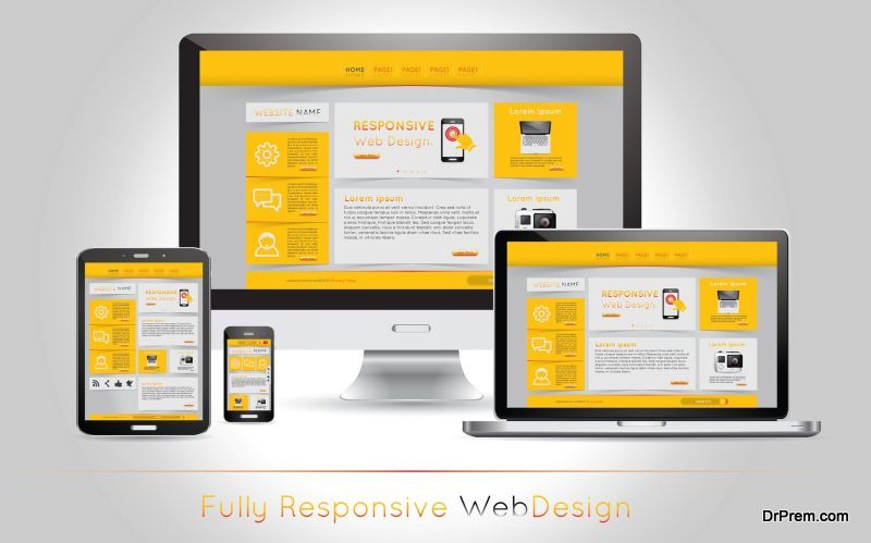
In any website, the navigation is one of the most important elements that users rely on to browse through available content. Attributable to its importance, web designers need to ensure that navigation is able to provide a smooth user experience, and help users to get around and find what they want.
Unfortunately that isn’t the case often, as there are some common web design mistakes that actually ruin the whole charm of navigation:
Too many items in a navigation bar

Your website may have lots of content; however, if your navigation bar contains too many links, odds are many of those items will lose prominence. As a result, users will find it harder to locate what they’re looking for because they are unable to pick it out. Generally, you should try to limit your navigation bar to five items.
Not enough space between elements
When there isn’t enough space between the elements in your navigation bar, it can look cluttered. Visually this won’t look appealing, and will detract from the user experience at the same time. Ideally you should ensure that the design of your website and navigation bar has sufficient space between each of its elements – including the text in the links.
Non-standard positions and orientations
Typically most navigation bars are either located in a row at the top of the page, or in a column on the left-side. While you may feel tempted to break that mold, it is often inadvisable to do so. The reason why these ‘standard’ types of navigation bars are so widely used is because they are perfectly positioned in the user’s line of sight. More importantly, users expect to find navigation bars in those locations – so positioning them elsewhere or orienting them differently will make your website harder to navigate.
Utilizing drop-down menus
Although drop-down menus can be helpful in some cases – most user experience studies tend to agree that they are often more of a hindrance than help. Because users need to actually ‘hover’ over the drop down menu to see what it contains, it makes it more difficult to find the navigation items that they require. On mobile devices drop-down menus are worse, as they actually need to be selected to appear.
Generic navigation terms
At first it may seem as though generic navigation term such as ‘About’, ‘Services’, and ‘Products’ are perfect for your website – but that’s rarely true. Instead of using such terms, try to be a bit more specific. For example, instead of having a navigation item that says ‘Products’, change it to be the specific type of products that your website contains, such as ‘T-shirts’ or ‘Golf Clubs’.
Try to avoid all five of these mistakes when designing your website’s navigation. Also discuss them with any Adelaide website design service that you may engage. It will help you ensure that you’re on the same page and accordingly, come up with a navigation design that promises a great user experience.
Article Submitted By Community Writer